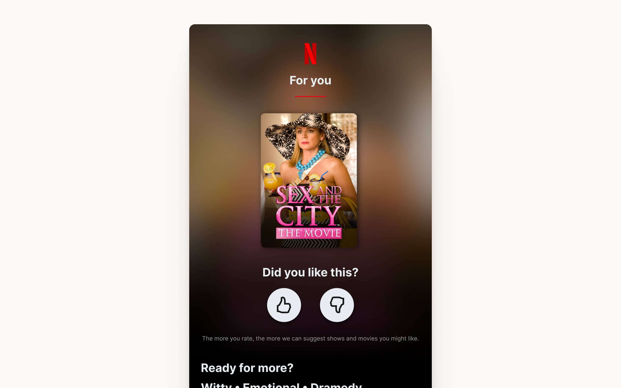
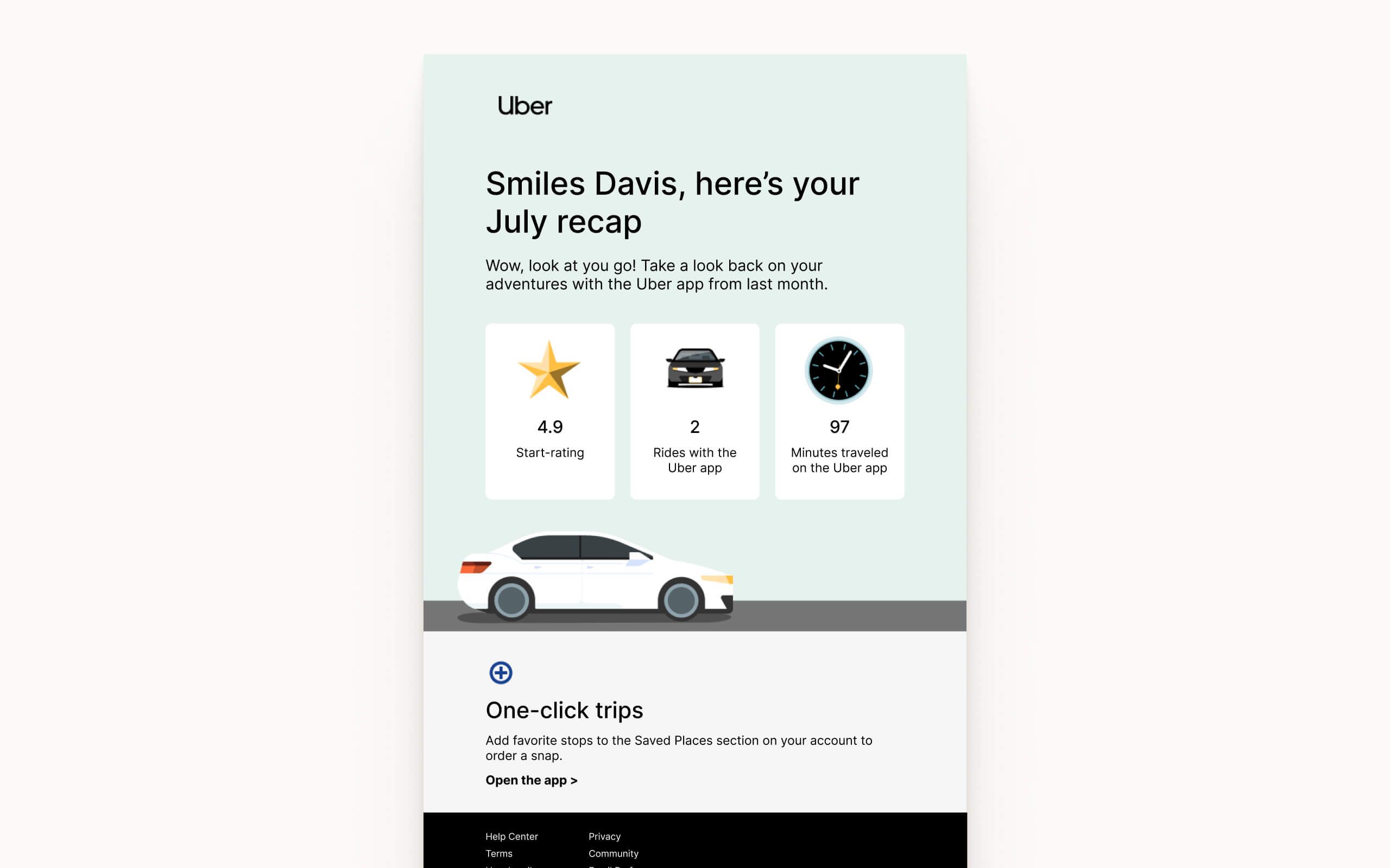
Included Components
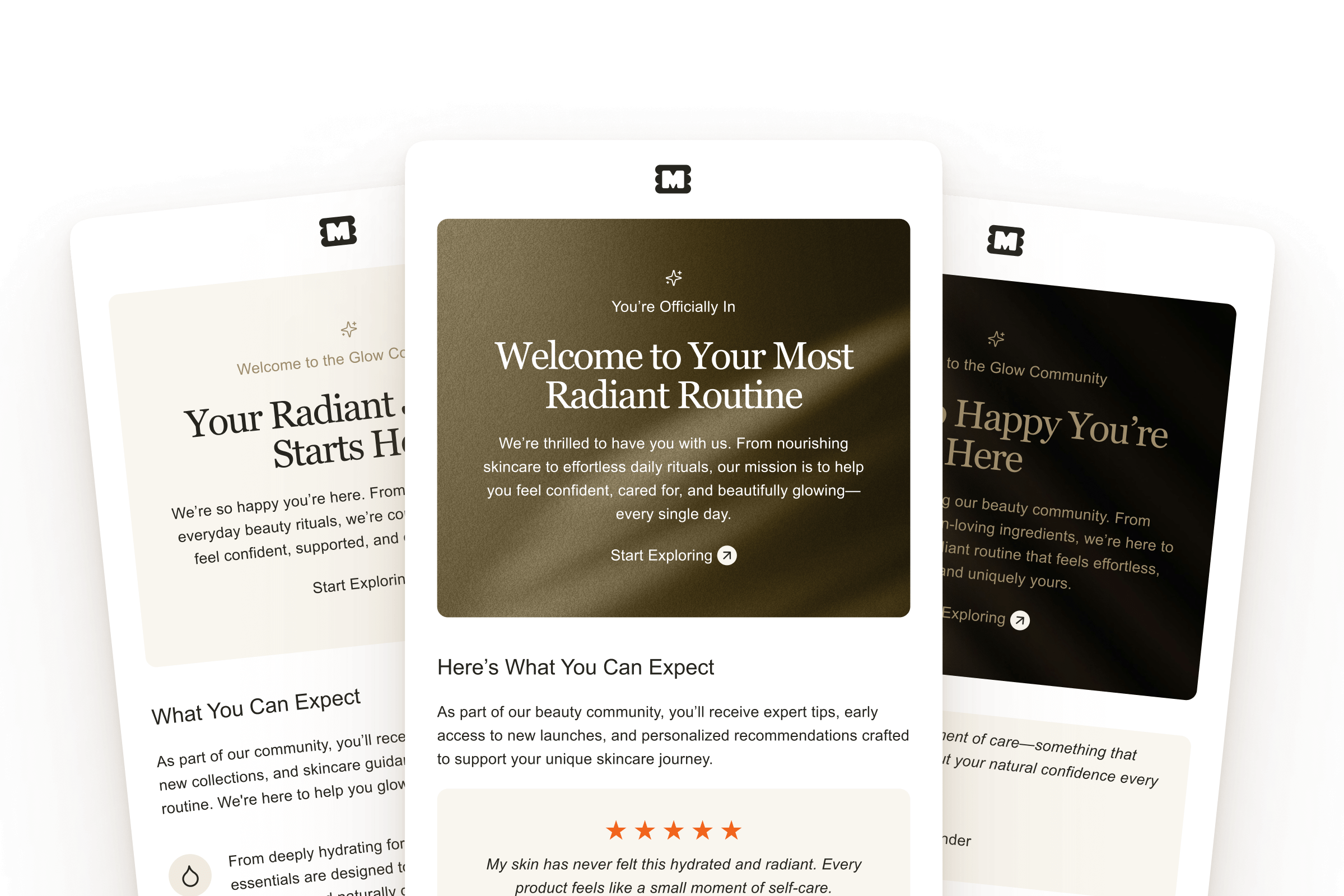
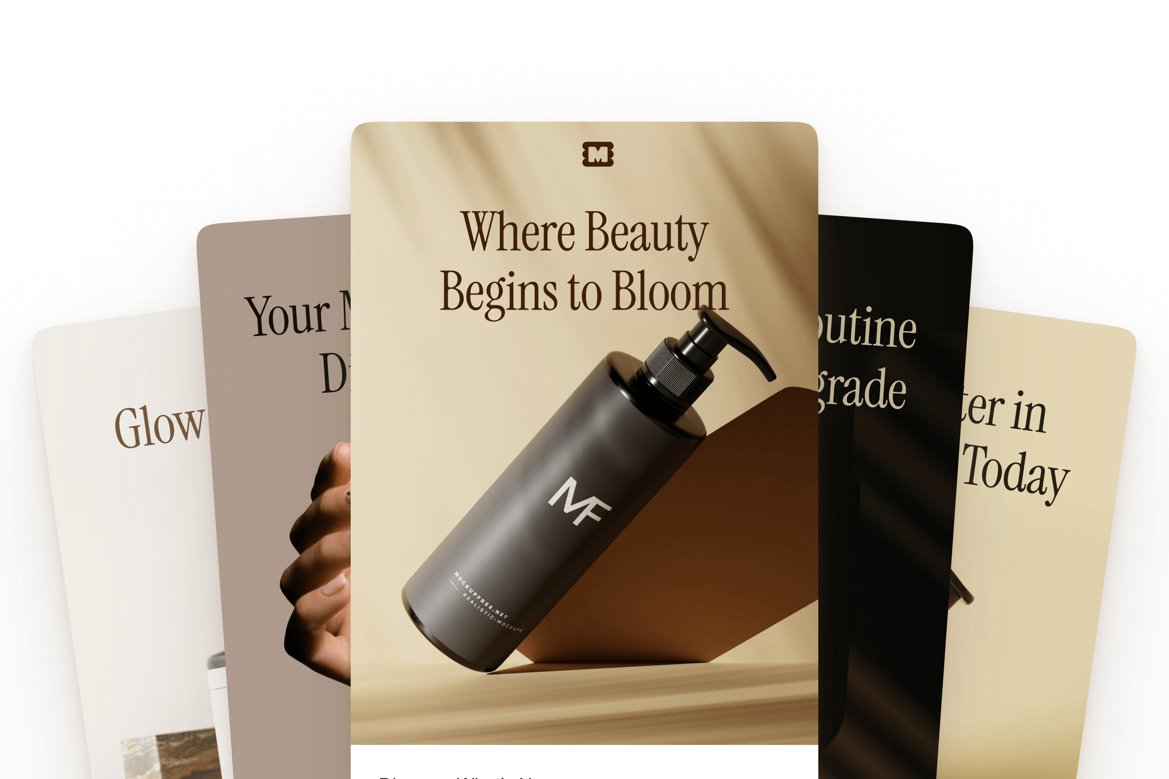
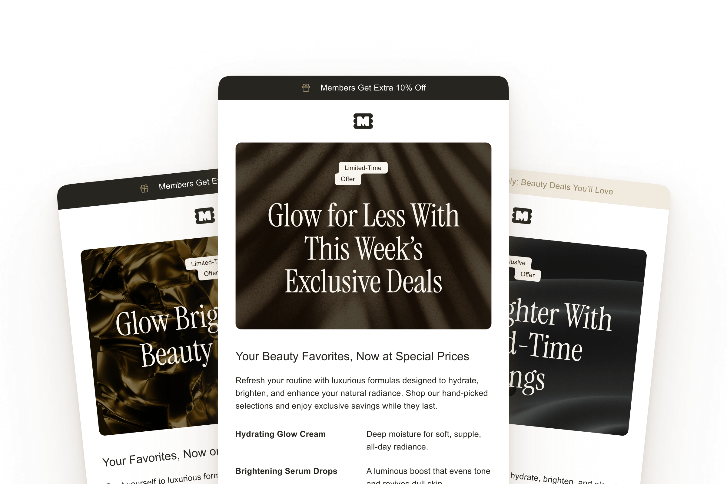
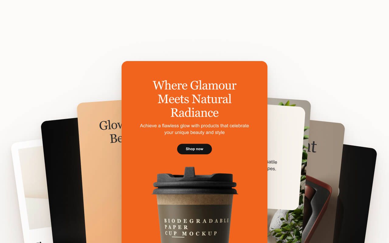
Editable Figma components ready to customize. All components use Figma variables for one-click brand customization.
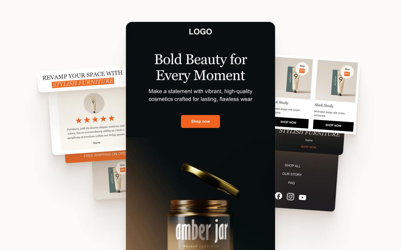
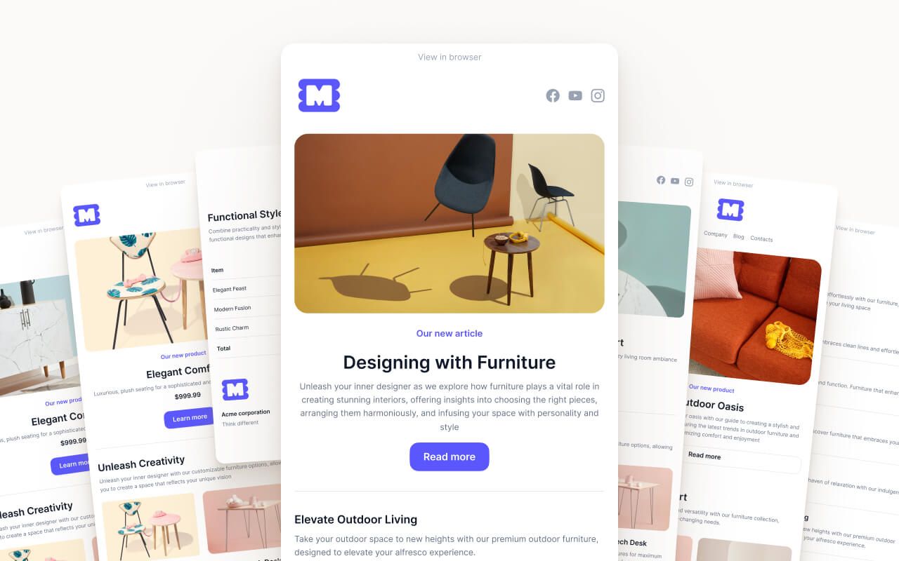
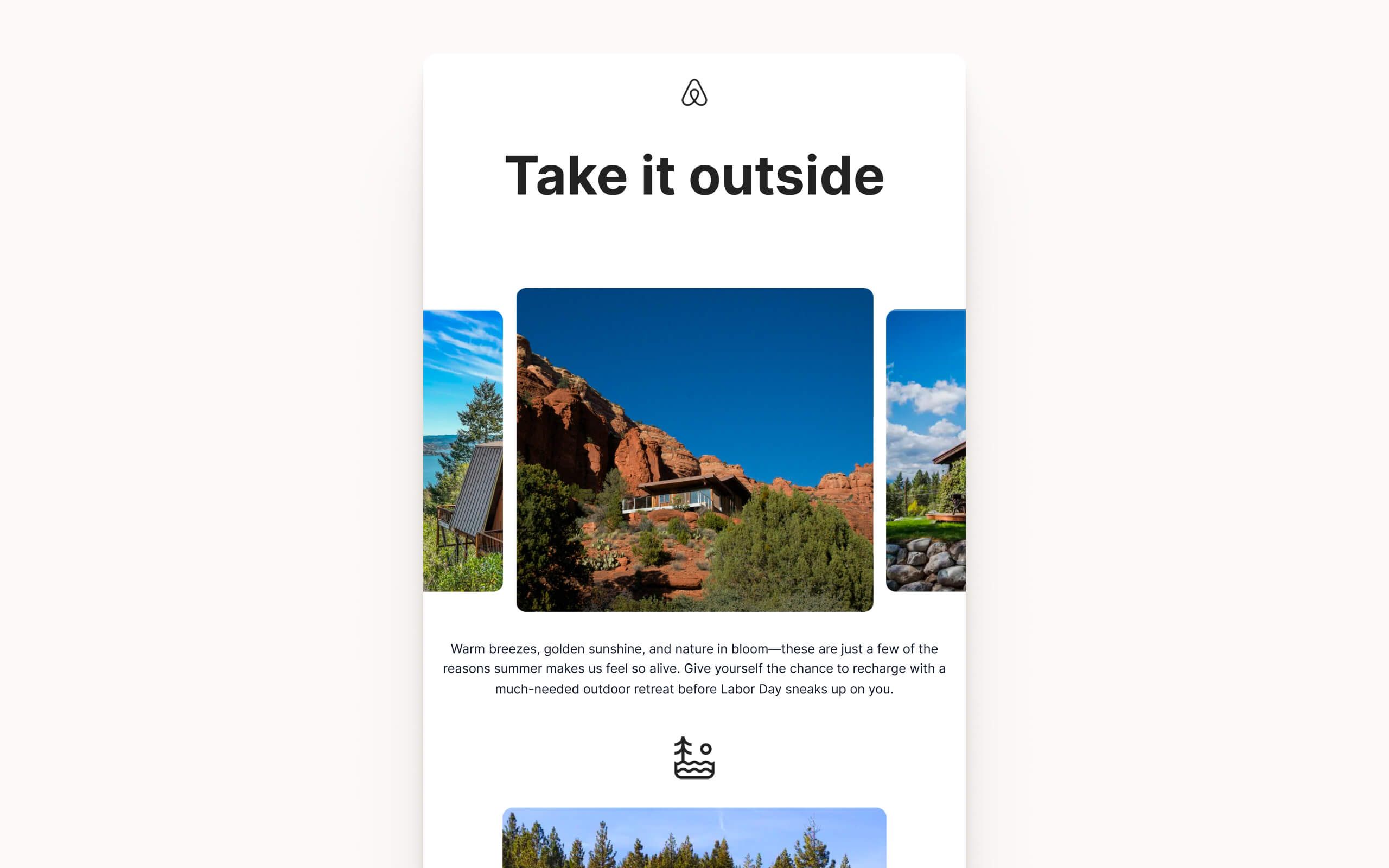
Header Section: Logo placement with optional navigation links. Responsive layout that adapts to mobile screens.
Navigation Block: Horizontal link row for product categories, account access, or key pages. Collapses cleanly on mobile.
Text Block: Body copy section with customizable typography. Supports headings, paragraphs, and inline links.
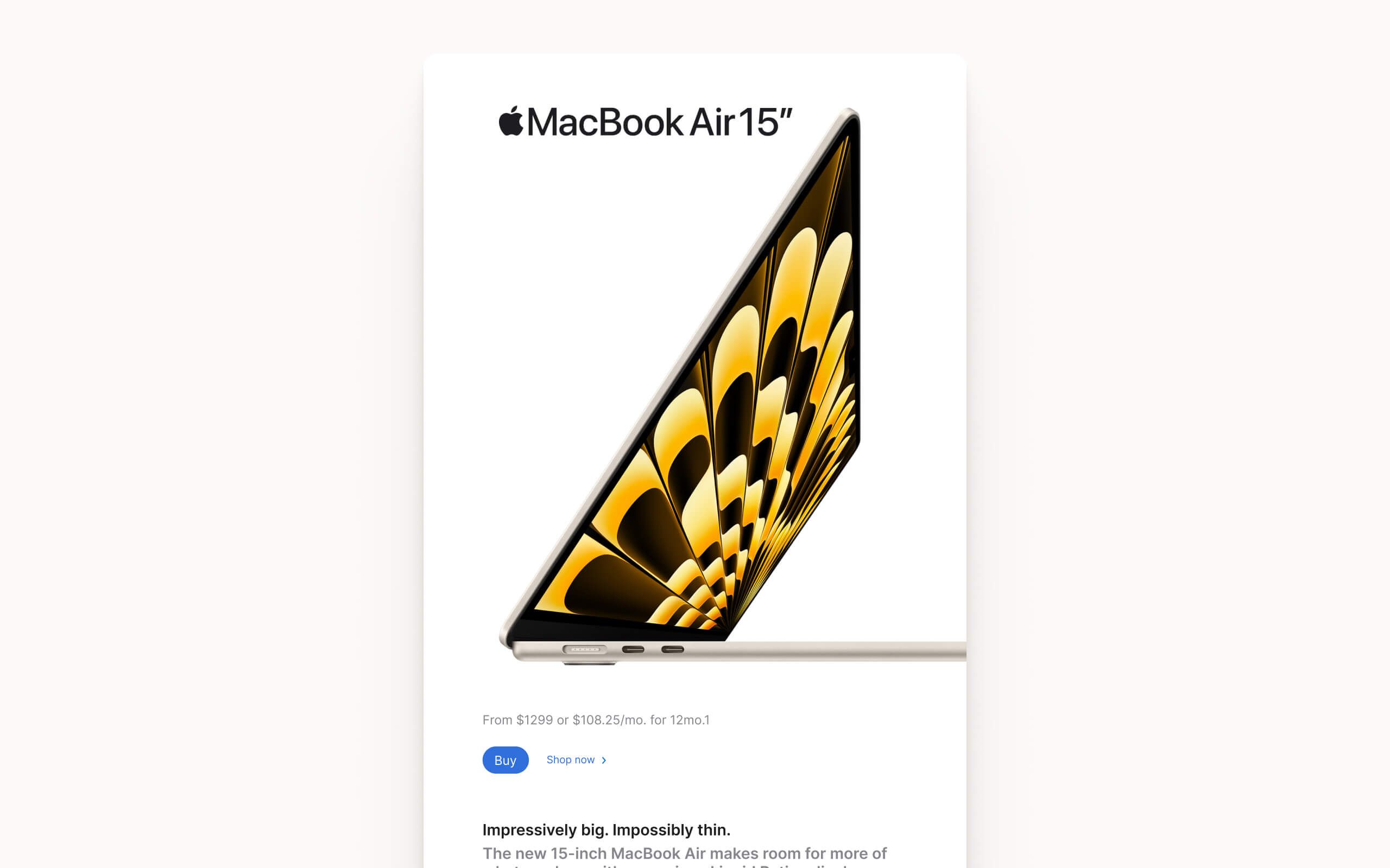
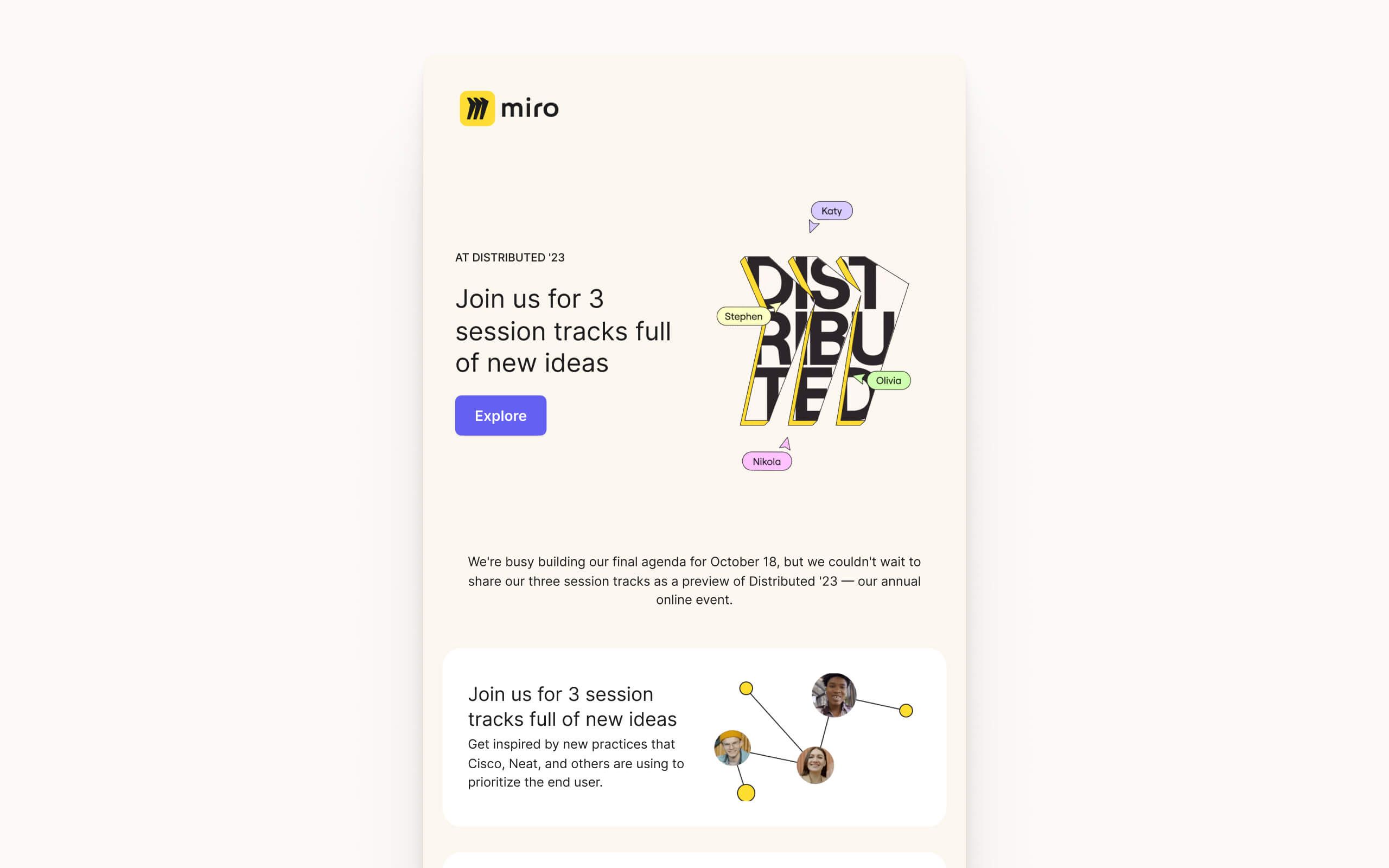
CTA Section: Title, supporting text, and button in one component. Use for primary actions like "Get Started" or "Complete Setup".
Callout Block: Highlighted message box for important information, tips, or announcements. Draws attention without disrupting flow.
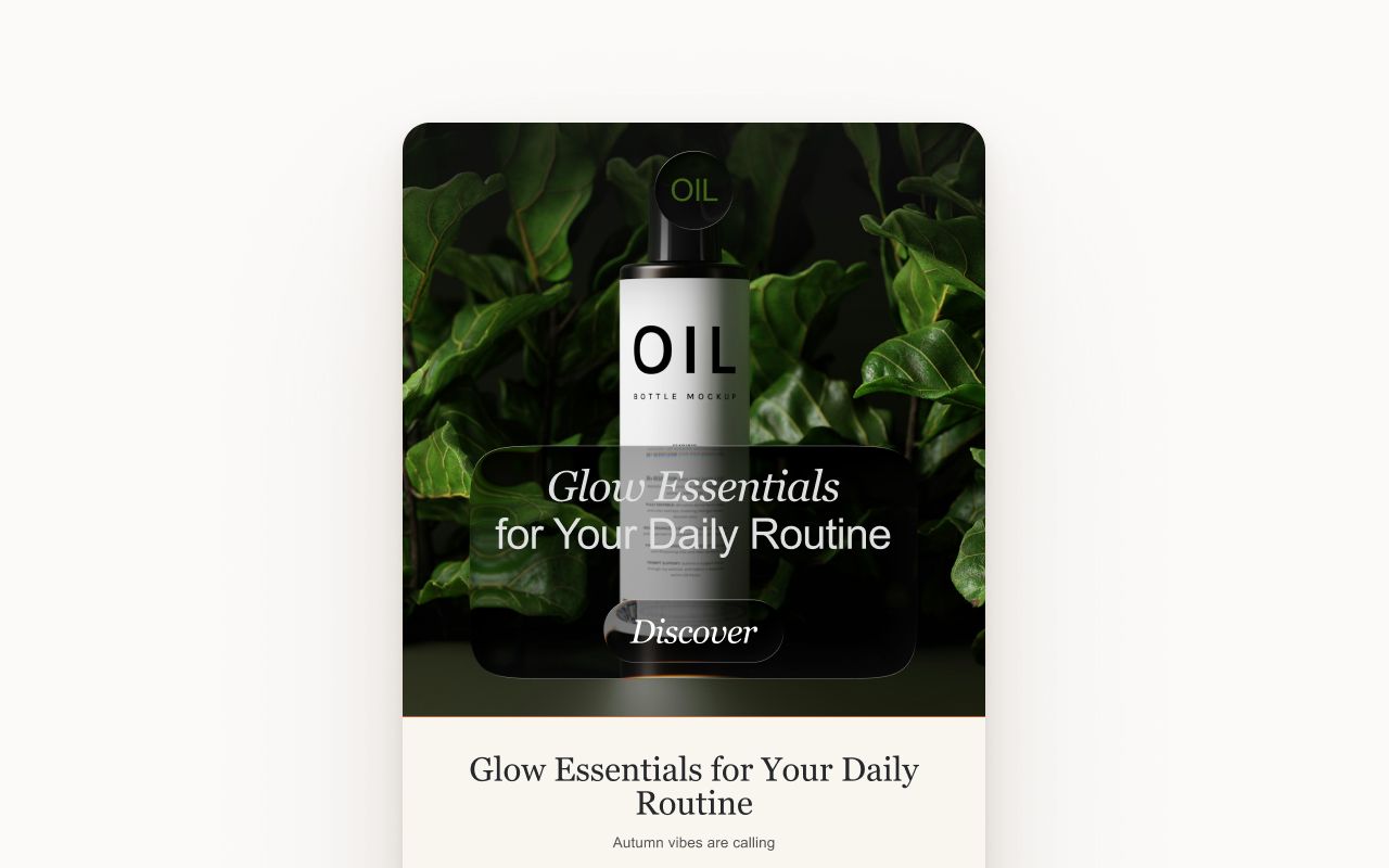
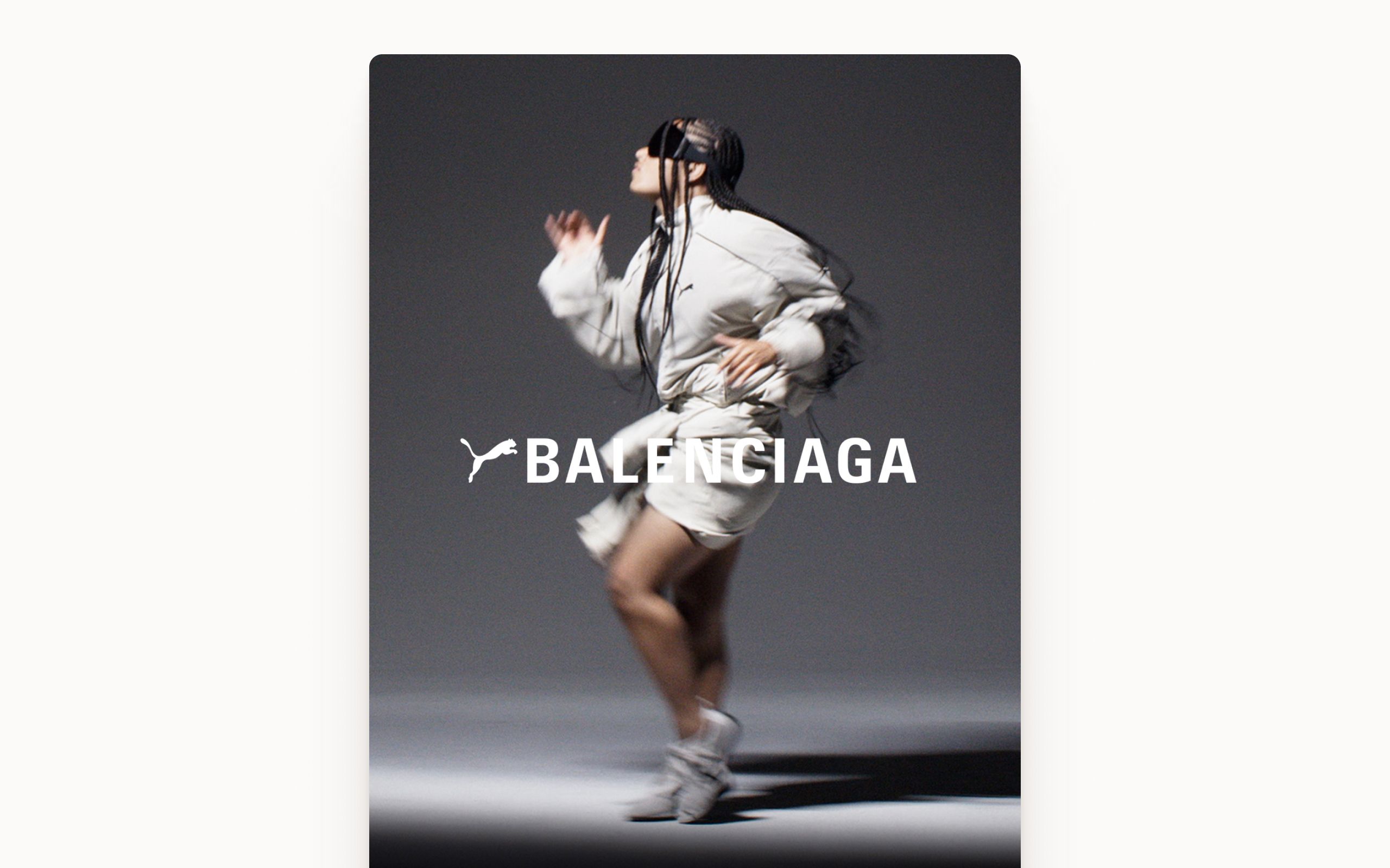
Promo Banner: Full-width promotional section for special offers, feature announcements, or upsell opportunities.
Quote Block: Styled testimonial or pull quote section. Includes attribution line for customer name and title.
Review Block: Customer review display with star rating, review text, and reviewer info. Build trust with social proof.
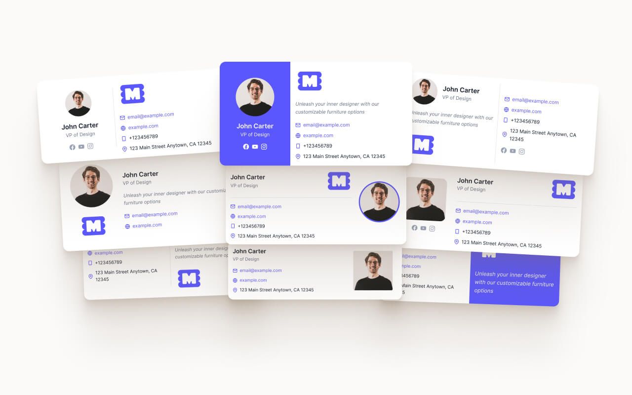
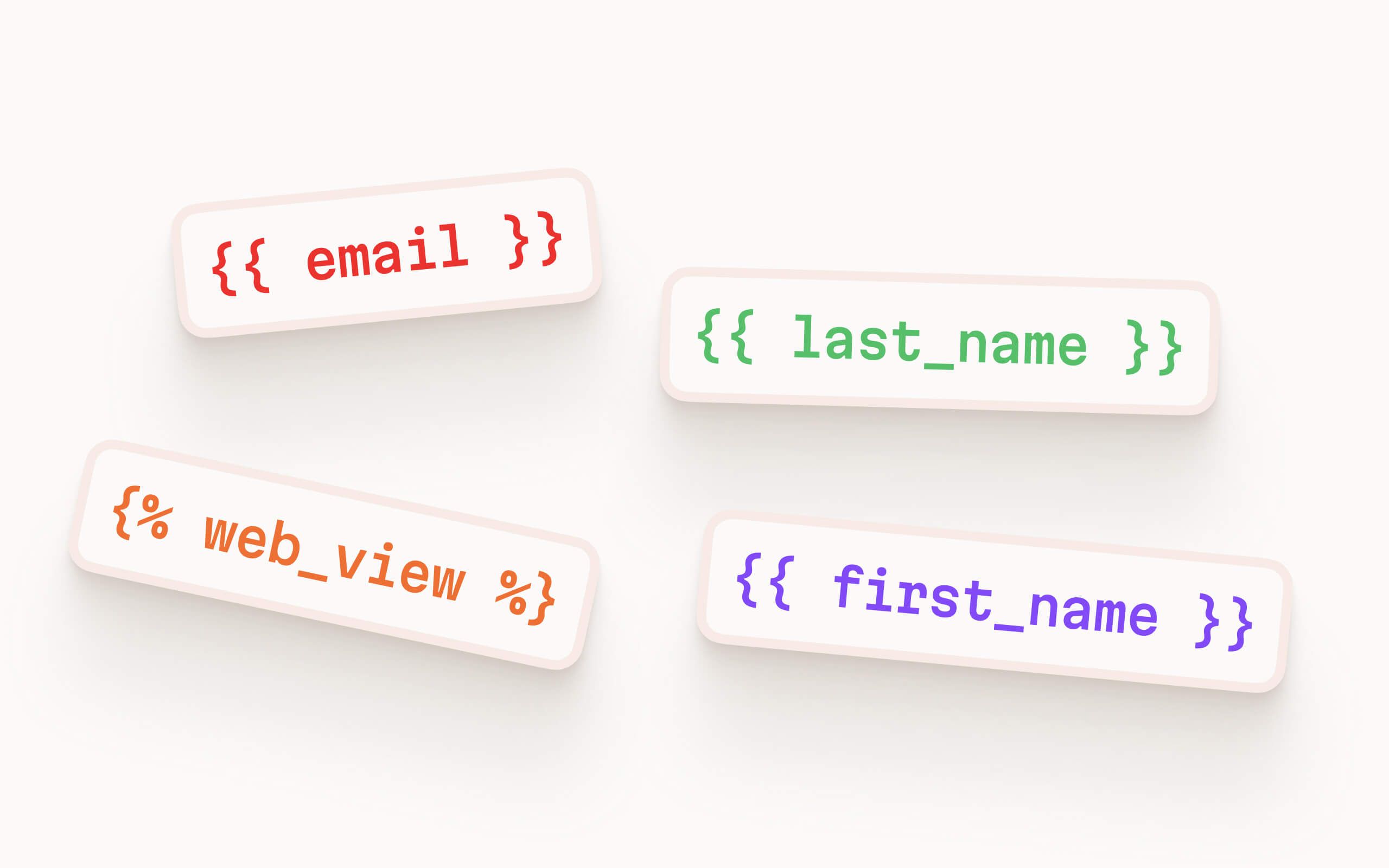
Footer: Company info, unsubscribe link, and social icons. Pre-configured with HubSpot compliance tokens.
All components use Figma variables for one-click brand customization.
Full export walkthrough: Figma to HubSpot Export Guide
